Painting a New Decade: 2020 Color Trends
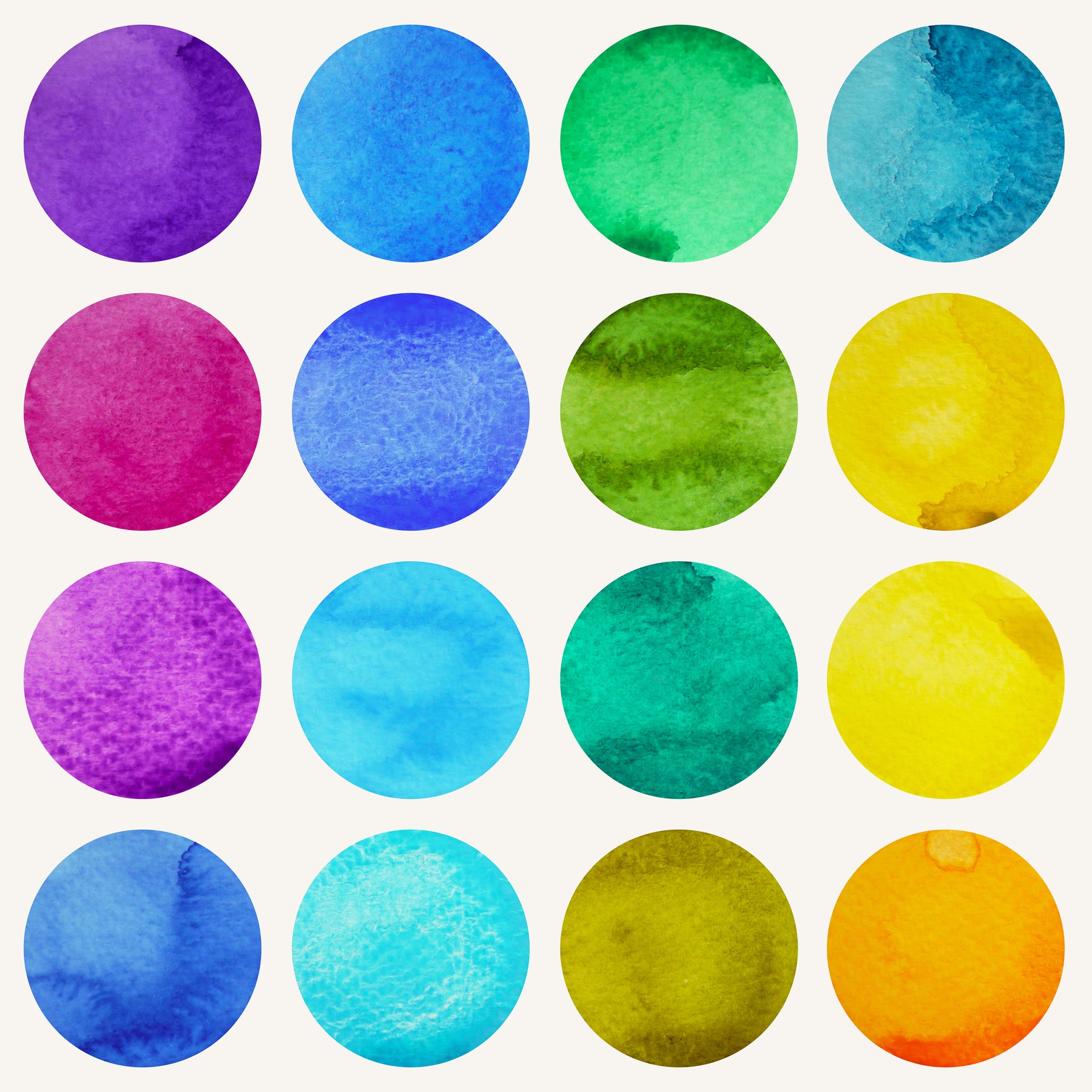
As we step into this new year, we are found with the opportunity to be the first leg in setting the pace for the next decade. It seems that every ten years is a new era. We remember The Roaring Twenties, the Radical 60’s, and the wars in between. During the end of the century, we became immersed in pop-culture, technological advancement, and now entering, what is, an epoch of the conscious human. We are beginning to paint a new period; one with peace and tranquility. This month, companies have made known their colors of the year. Each one, it’s own definition of this coming age.
Behr shares the color trends for 2020, all of which are inspired by natural elements. With technology continuing to reveal our influence on the earth’s health, we are taking considerable measures to protect it. In doing so we also become more appreciative of our planet. For this reason, the trending colors are stimulated by sky, earth, water, and plant life. Of the colors selected, one stands out among the rest, “Back to Nature”. The desert green hue earns its title with the popularity of the succulent. This color makes the outside graciously available indoors. By balancing the two opposing worlds, “Back to Nature” aims to invite a calm atmosphere into your home.

Meisel Contemporary 2-Piece Tufted Linen Daybed with Twin Trundle Set
Sherwin-Williams also names their color of the year, “Naval”, as a calming stimulant. The reassuring color is inspired by the tranquility of the sea. Your eyes can almost hear the waves dancing beneath the moonlight. It’s also no surprise that this deep blue combines boldly with gold metallic accents. We see the attraction of these colors on the shores, where the water meets golden sand. The timeless color reminds us of the harmony that nature creates. A peaceful relationship is one that can be emulated in your own home. Sherwin-Williams gives an exemplary “Naval” kitchen cabinetry spotlighted with gold.

Rosador Modern Rose Gold Leg Bentwood Chair

Aniah Scoop Frame Flannelette Chair & Ottoman

Tallulha Contemporary LED Tufted Flannelette Bed

Mateo Transitional Single Drawer Youth Nightstand
The primary color seems to be making quite an impression on many color experts, including PPG paints. The company has deemed “Chinese Porcelain” as the blend of calmness in a restless society consumed by technology. At the speed that we’re going it’s no wonder why people are keen on slowing down to take in life. Blues, like “Chinese Porcelain”, offer an escape into nature's serenity. PPG suggests combining the spirited color with metallic finishes such as copper. The color combo, like that of "Naval" and gold, reveals a relationship between blue and, complimentary, dusty sand tones.

Prismo Transitional Youth Bed w/ Trundle
This color harmony agrees with, yet another paint expert, Pantone. The company, founder of the “Color of the Year '' tradition, has determined “Classic Blue '' to be 2020’s focal point for the color forecast. Blue is a confident color that has pushed out gray. “Classic Blue” is the sky at dusk, when the world is at the end of their sleep cycle. It’s the anchoring foundation of your day. The air is clear of the hustle and bustle; boundless. This freedom gives way to your thoughts which breath cool reflections. In those moments, the singing stars fade into the light of the rising sun. But the melody of meditation carries you through the day until twilight is painted across the sky.

With our lives becoming increasingly distracted by technology and obligations to make the next dollar, we lose sight of the opportunities to illuminate our souls. Fortunately, nature has provided the colors to rejuvenate us. This year let shades of green, yellow-undertones, and bold blues restore your living space.

Leave a comment